
what we do
Mobile
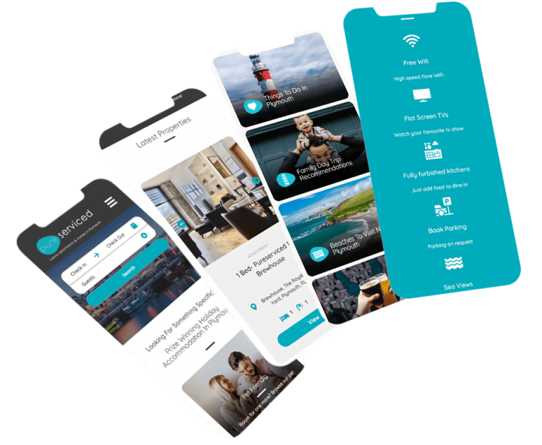
Look your best, everywhere you go. Delivering a great site across all devices is a modern must.
Don't get lost in the noise
Look amazing, wherever you are. In immediate response to fleeting ideas, customers are relying heavily on their handheld devices to get online. Does your site measure up?
What we think
The surging category of mobile browsing has recently hit 60%. That’s 60% of the entire world’s internet access being performed mostly on mobile devices. Plus, if you run a Google search on your mobile, you’ll see that responsively designed websites within the results will be assigned a ‘mobile-friendly’ badge of honour.
All this points to what we’ve known for a long time: responsive websites are becoming more and more vital to the success of a modern business.
Mobile vs. Desktop Usage Insights
What we do
You’ll see from this very website that fantastic, elastic designs are our speciality. Designing a website that adapts and flexes to the screen on which it’s being viewed is an art which we’ve perfected.
Using the latest coding and experience with iOS, Android, Windows Phone and a variety of hybrid application technologies, we carve a solid path through the minefield of responsive design.
The result? Truly beautiful websites that work hard around the clock, all over the world.
We will:
- Explore your mobile presence in relation to your customer profile(s)
- Place your mobile presence among a wider digital plan
- Develop responsive design with your user at its heart
- Plumb the depths of user experience (UX)
- Design said app if appropriate
- Come up with app concepts and test them rigorously
- Employ native and hybrid technology
- Test various versions within our own development lab
- Employ a mobile search marketing plan
- Design said app if appropriate
- Develop geo-targeted promotions
- Blend your mobile site with social media
- Set out KPIs and perform regular analytics
What's Happening?
In today’s world, it’s important for websites to be accessible and usable on a variety of devices, including desktops, laptops, tablets, and smartphones. This is why all device sizes are considered from the design phase of a website project.
Designing a website with multiple device sizes in mind ensures that the website will be able to adapt to the user’s device, regardless of the size. This is achieved through responsive design, which uses flexible grids, images, and media queries to adjust the layout and content of the website based on the user’s screen size.
Consideration of device sizes in the design phase of a website project is critical as it ensures that the website looks and functions as intended, regardless of the device being used. This means that users will have a consistent and enjoyable experience, regardless of whether they are accessing the website from their desktop computer or their smartphone.
It’s worth noting that the design phase is just the beginning of the process. Testing the website on different devices and screen sizes is also important to ensure that the website is fully functional and optimized for all users.